UX research on Blackboard App (E-learning)
Collaborating partner: Norwegian University of Science and Technology
Problem, and project’s contributions
The goal of this project was to make an improved version of the Blackboard app. The blackboard app is a software system that manages all aspects of a digital learning environment. At the moment many students are complaining about how the interface works, and there are many features that are not used.
Team and task
Magdalena Maria Miazga: Assist the team in user testing and margining findings
Lilian Frederique Adriana van den Bos: Particularly helping the team in project writing, and user testing.
My role
I was responsible for planning the research. This included looking at the current platform, listening to feedback at different stages, and suggesting design improvements based on our analysis.
Project Flow
Usability testing and follow-up interviews
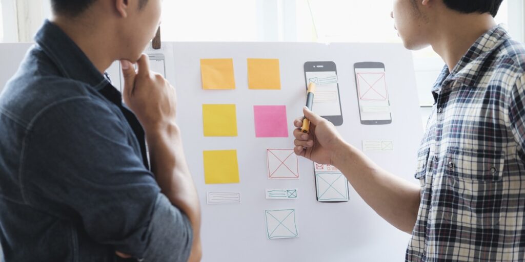
In order to suggest the improved interface of NTNU Blackboard App, usability testing methods, such as think-aloud and retrospective interview were used. Students from various levels of degree, departments, programs, countries, have contributed to this examination. Findings: the app does not satisfy the needs of the students, the user experience is bad with respect to the content, design and the functions in the app. The content is confusing and different from the Blackboard website. The design is outdated and navigating through the app is confusing. Functions like push notifications do not always work, and a function like time schedule is missing in the app.
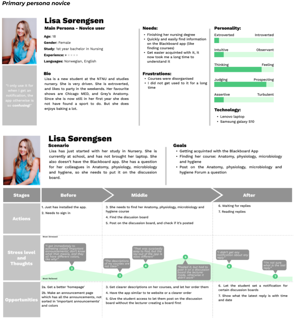
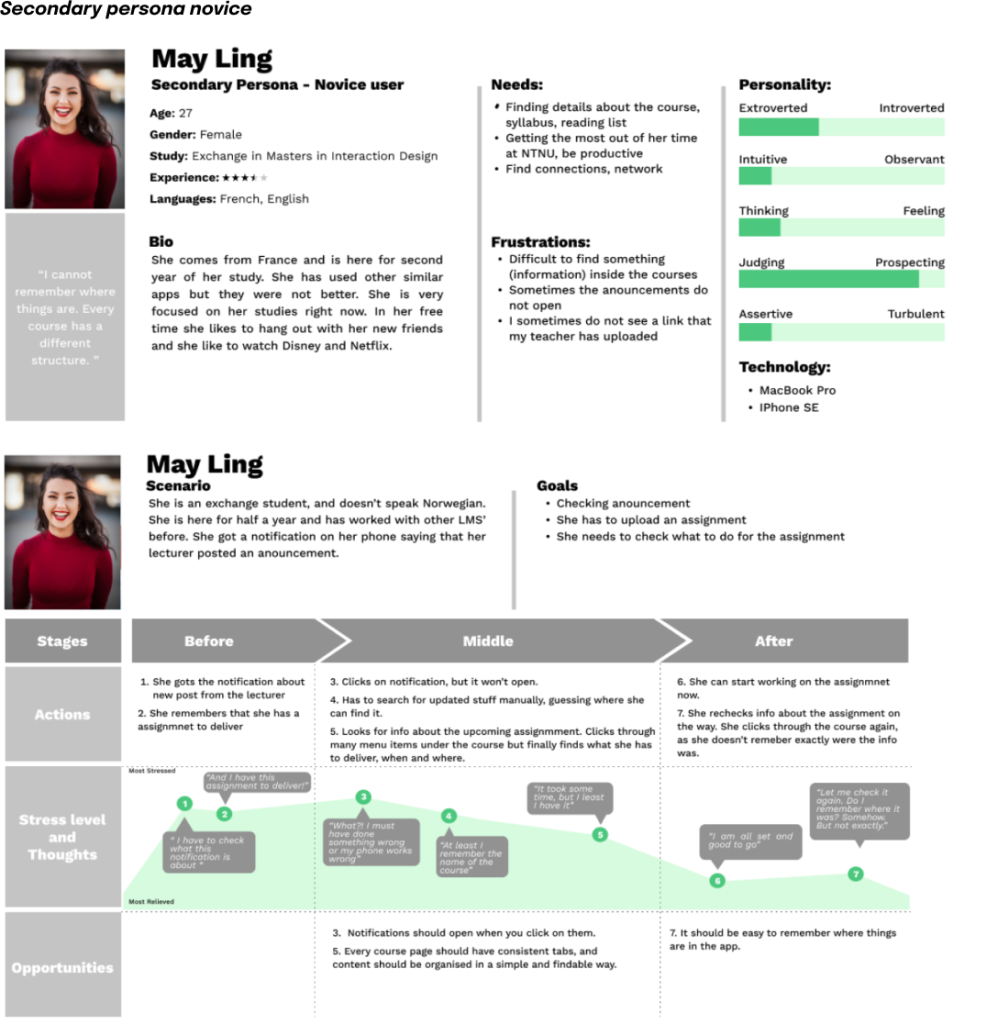
Personas, and user journey
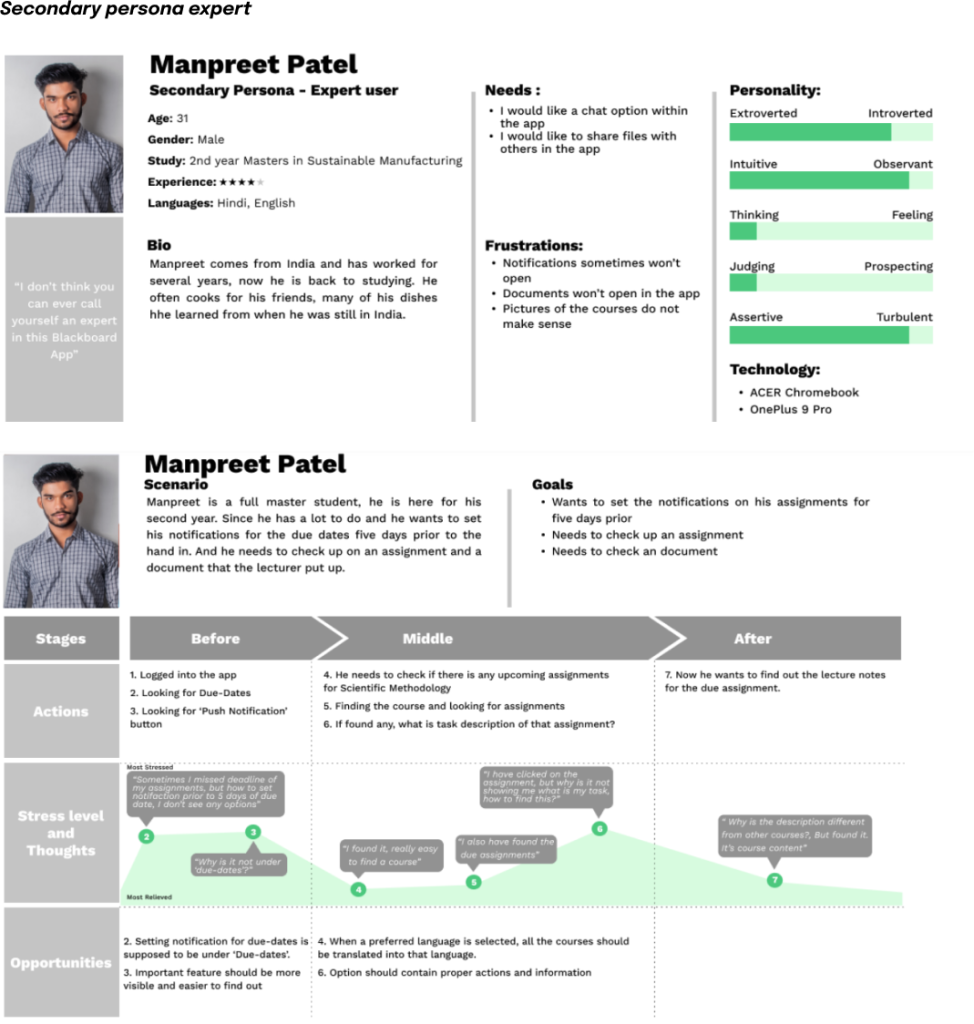
Identifying design requirements
The first eight items are items that should be incorporated in the app.
1. A view of registered courses (for the current and previous semester, including the next sessions)
2. A newsfeed (which presents and summarises all system-wide and course-related news), also
known as notifications
3. A messaging system
4. Settings of language in the app
5. Search system
6. Help
7. Calendar
8. Timetable with room numbers
The next items are some rules that the app should abide by.
1. Clear navigation system, both structural and name wise. The user also needs more navigational
freedom.
2. For uploading system add a ‘delete’ or ‘edit’ button
3. More comprehensible marking of the courses
4. Add an option to let the students choose which courses they want to see
5. Make the discussion board available for all, and easier to navigate (like what reply is the latest and
where the discussion boards are)
6. Let the students set a notification for certain discussion boards, and due date
7. Possibility to see all the assignments for the whole semester
Prototyping
1

2
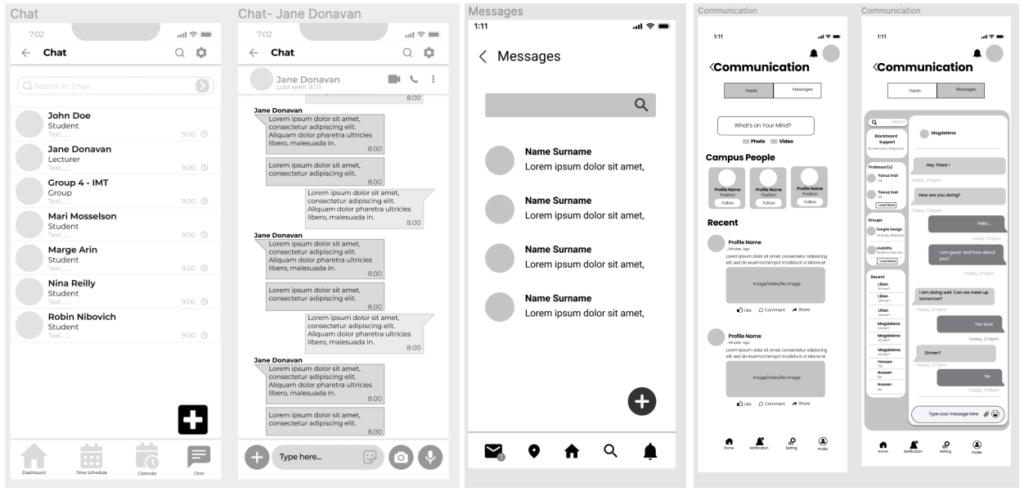
3
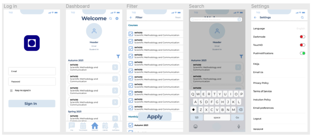
Follow up usability testing
We created three versions of the prototype and select one based on the requirements. Then, we proceed with usability testing of the improved version. User were given five tasks. and after performing five tasks, users answered questions regarding their experience using the app and provided suggestions on possible improvements. To be able to compare performance of the new app with Blackboard, tasks chosen were like those conducted in the research phase.
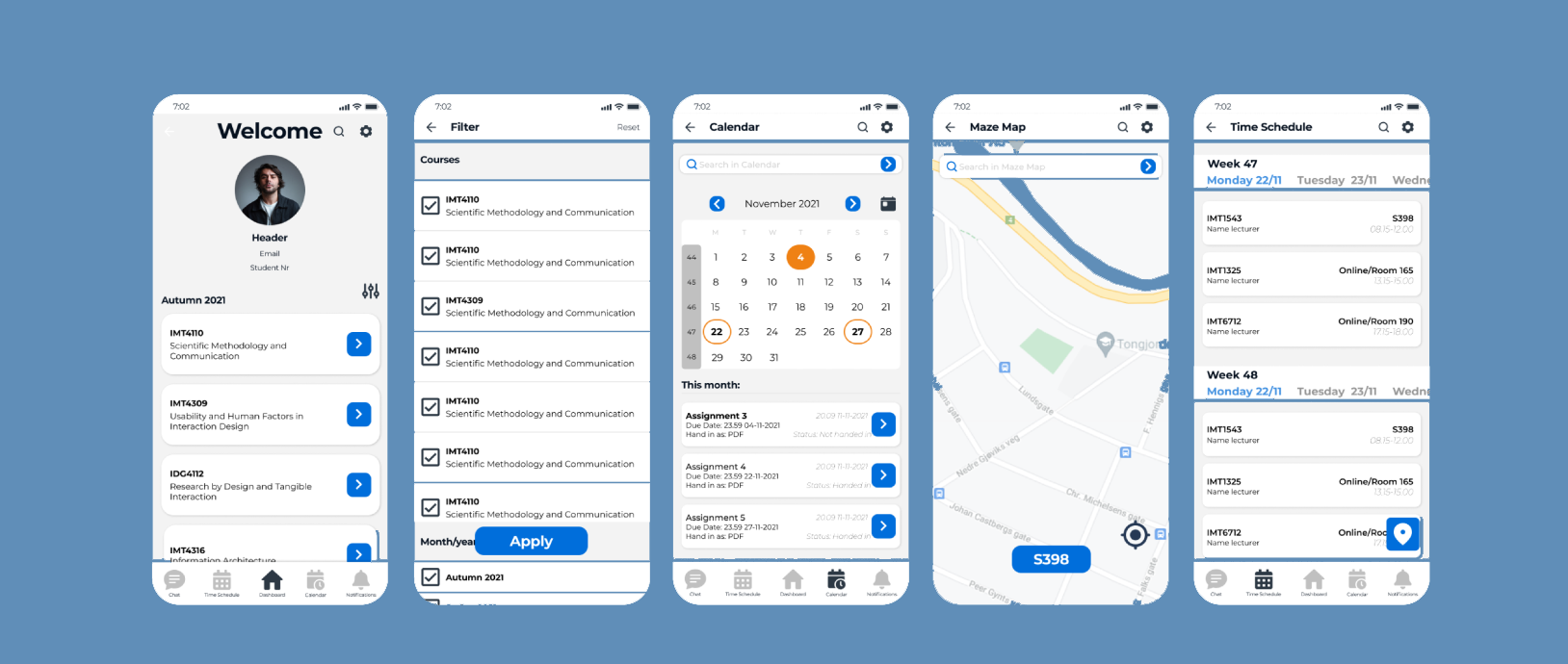
Taking into considerations valuable feedback from user testing, as well as our own thoughts on how the app should develop, several improvements were listed:
• Differentiate between Calendar and Time Schedule icon.
• Change Calendar name to Due Dates.
• Find an alternative to the use of grey in the navigation menu.
• Provide weekly view of Schedule.
• Ensure language option before logging to the app.
• Make scroll inside the course more noticeable.
• Highlight the course name, not the number.
• Enlarge Search and Settings icons.
• Add more complementary colours.
• Develop dark mode.
• Show a loading bar, it will be clearer if something is loading or not.

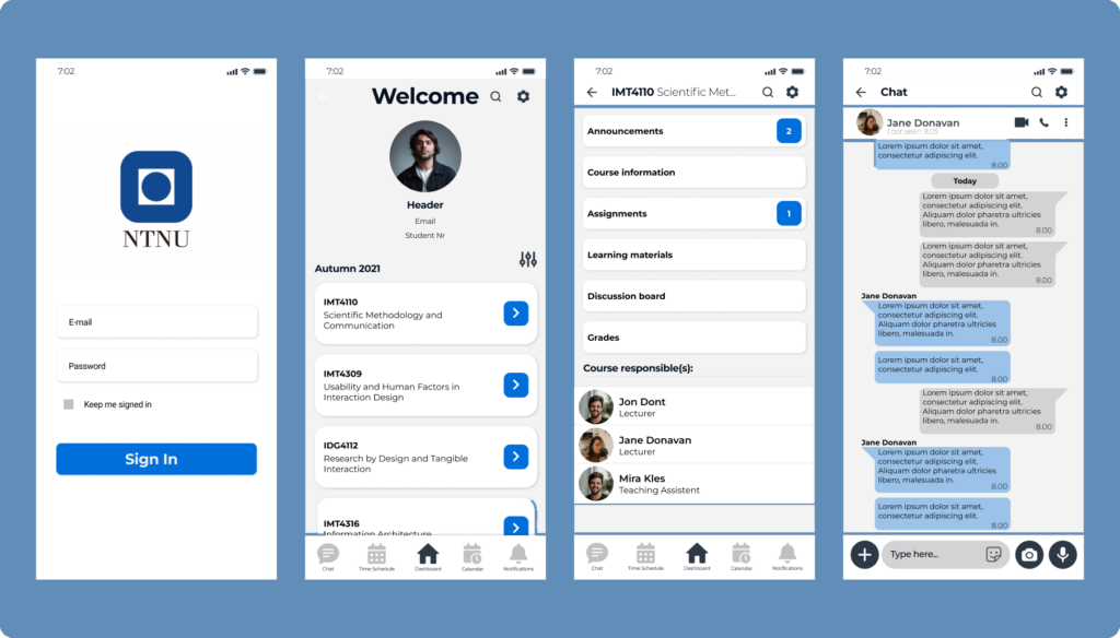
High fidelity prototype
As we were designing app for the university purposes, we decided to be very settled with our colour choices, that is the reason why we agreed on monochrome blue palette, supported with black and grayscale shades (suggested in the NTNU guides), and small yellow, orange, green and red accents (which belong to the NTNU’s graphic profile). With the NTNU-blue as the starting point this palette was created.
©2024. Md Hossen Ali. All Rights Reserved.